
When I was in my mid-20s I remember reading an article that featured this gorgeous house in California full of color in Real Simple. Unfortunately this article was written years and years ago, and perhaps up to 50 issues ago, so I’m sorry that I can’t share it with you all because believe me, this woman knew how to work with color.
Adding color into a house can be scary- how do you know what color is right for a room? Once you choose a color, how much navy in one room is too much navy? And how many colors can you have in one room without it looking like a circus, too matchy matchy or even too monochromatic?
The biggest takeaway from that article was the rule of 3. Choose 3 colors, and make sure everything in that room has at least a spec of one of those three colors.
Since becoming a suburbanite and having a house that I knew I wasn’t going to be leaving after 8 months like my track record in NYC, I have maintained this rule of three and it’s worked out great for me.
I recently had our bathrooms repainted (shout out to Kelly Contracting in Doylestown for help with that!) and couldn’t be happier with the revamp of our guest bathroom upstairs shown below is a mix of Olive/Taupe paint, white & black.
Here’s how I did it.

1. Choose a paint color
I like choosing statement colors for bathrooms and leaving the neutrals (white, taupe, creams, greys) for common spaces and bedrooms. I love this army brown color and think it looks chic and clean with the white sink, toilet and shower curtain.

2. Choose 2 other colors to work within the room if you choose a darker wall color, or 3 if you went with a neutral paint color.
Since white is so prominent in this room – the sink, the mirror and the toilet are all white and they aren’t going anyway, I choose to stick to black, white & creams to play it safe with color here. I also use this bathroom to get ready in the morning so a clean simple room is better for my psyche.
3. Experiment with patterns in your color scheme and metallics.
I don’t count gold or silver metallics into a color pallet. I think they bring light and life via reflection more than color into a room and I like peppering them through out a space to bring an element of glam to a space. I think in a small room, less is more and a picture, a few candles and a basket to hold room spray and extra toilet paper is more than enough for a guest bathroom.

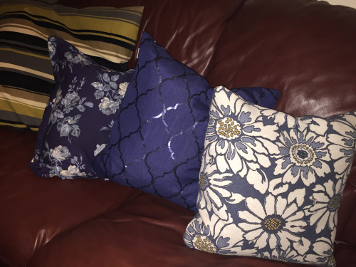
Below is an example of experimenting with patterns and color. My living room has brownish/maroon leather couches and black leather furniture (not by choice–what is with men loving leather couches and accents???). With those two major colors already in play and them not being a workable neutral, I had to concede to only working with one additional color, so I chose navy. I made sure each piece I purchased had either black, navy or brownish maroon as shown below. Although all of these 4 pillows are very different and include extra colors outside of the 3, they work because at least one of the colors in the pillows is within the pallet.
If you are nervous about color schemes, you can choose the color you like, for example Grey and google What colors go with grey? and hundreds of sites with hundreds of color combos will come up. Or, you can always email Hallier Home for insights.
Hope this helps and happy decorating!
